A top-notch landing page is one of the most important parts of driving traffic to a site, once you’ve got the traffic, it’s time to make the most of it. Just like a good first impression, there are a few key techniques that can help a business convert the traffic they work so hard to maintain.
Crucially, there are also some common mistakes businesses make that lead to missing the mark on their landing page, whether they realize it or not. It is a competitive world out there. No matter what’s on offer, there’s someone out there trying to outbid you in the race for customers. Your job is to make sure that doesn’t happen.
Headings and sub-headings
Everyone has come across a dry headline at some point in time. Headlines that immediately have visitors losing interest can result in them clicking off the site and you losing a sale.
Most visitors will make up their minds within the first few seconds of visiting a page, so headlines need to be simple with words that help confirm the offer or answer the question on the reader’s mind.
Major businesses also use a subheading for more explanation on the value being proposed. The heading could be “Latest cars on a budget” then the subheading could help further explain like “Get the latest edition cars as cheap as $500”.
Always keep the visitor’s journey in mind.
What will keep them and even covert them is if your page can tell them what you’re offering and why your offer is awesome.
Try using numbers in the headings too.
“80% of our customers had success within a month” or “12 ways to increase traffic”.
It’s the quickest way to get the most important information out there and they grab people’s attention, giving them a reason to find out more about what you’re offering.
Captivating design
Just like a boring headline, the page design will either welcome or scare away traffic in an instant. A dull landing page gives visitors little motivation to explore the site and find out more about what the business is all about.
Broken or unclear images, poor color choice and a flood of ads above the fold (the top part of your website that visitors will first see without scrolling) are also factors that instantly turn the viewer off.
Think of the top of your webpage as your shopfront. If someone walks past a store and isn’t interested in what you’ve got displayed in the window, they’re unlikely to walk in the door.
What your visitors see when they first hit your site is crucial.
Your first 10 words are more important than your next 10,000. In fact, if your first 10 words aren’t the right words, you won’t have a chance to use the next 10,000.
Elmer Wheeler
Using great copy is only half the battle, it needs to be clear and easy to read. Not just the words but also the design. If you’ve got some of the snappiest headlines on the web, they won’t do you any good if your visitor’s eyes wander elsewhere.
Everything you add to the page creates a visual weight. Images, text, white space. The lot! So make sure you keep things balanced and create a flow for the visitor to follow.
Use your unique selling proposition
One of the top mistakes that businesses make is leaving out a unique selling proposition (USP). Without one, visitors are left confused about what the business is about and what should happen next.
There’s an alarming amount of websites out there that assume visitors already know everything they’ll need to make a purchase. This leads to higher bounce rates and your traffic landing on competitor sites.
The best approach to converting your landing page visitors is to keep it simple and to focus on one key piece of information that visitors are to take away from visiting the site. Talk about a single relatable problem along with the solution that you can offer. But don’t just stop there, give them benefits why going with your solution is better!
Feature the USP in concise crisp points above the fold on your home page as a headline.
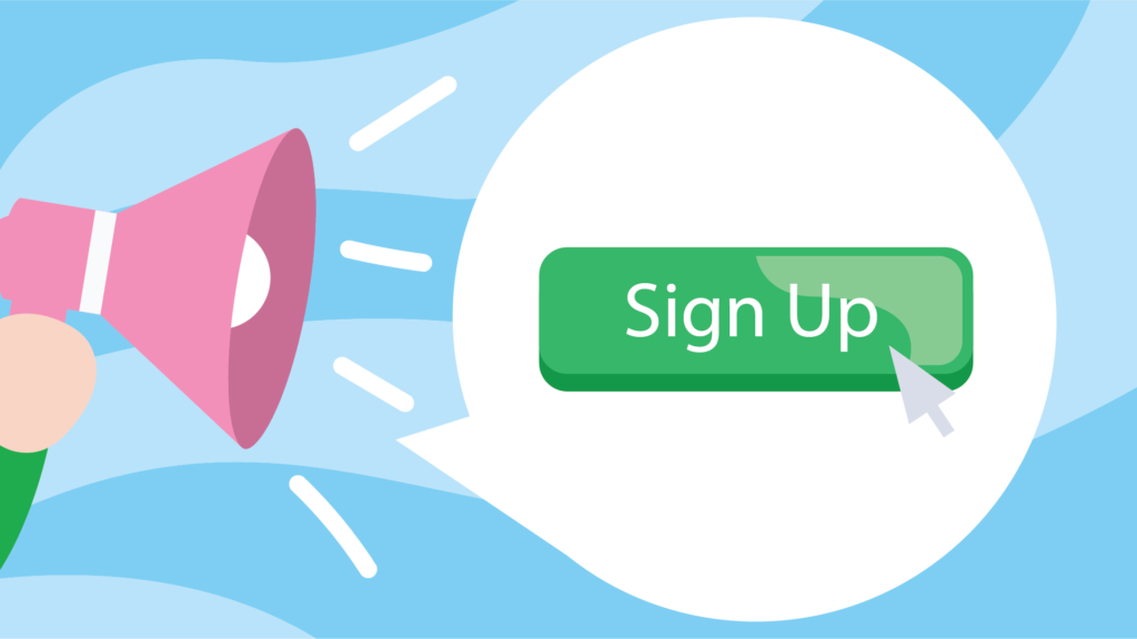
Call to action
Every business wants visitors to do something on their site, whether it’s to sign up, download or purchase something. A page that’s missing its call to action or has far too many of them loses traffic fast. The copy for your page should be geared towards giving them a sense of urgency to click.
Go into detail about a common problem and then offer a solution that they simply cannot pass up. Add statements with trigger words that will compel visitors to click through by offering them a benefit. Words like “Download” or “Submit” often instill a sense of fear of the unknown of what may come next. These single commands tell visitors they need to do something without giving a clear benefit.
Phrases like “Start My 30-day Trial” or “Get My Free Quote” are simple and clear benefits with little risk. All they have to do is just click a button to gain something new.
When in doubt use this formula; I want to “blank”. Fill the blanks with your call to action and you can’t go wrong.
If you’re really keen on your visitors following your call to action it works best without anything else on the page distracting from it. That means removing all of the other links on the page.
Each link that leads somewhere other than directly to your call to action will have an impact on your conversion so make sure you know the true purpose of the page before you start building it.
Build trust
By nature, humans are wary. Especially on the Internet and they have good reason to be so. By broadcasting a vibe that expresses safety and trust, you’re more likely to see conversion rates go up.
This is where trust signals come in. Including logos of well-known companies you’ve done business with, awards you’ve won, renowned accreditation boards and associations you are a member of, help subconsciously build trust in the mind of the visitor.
A great landing page puts its visitors at ease, making them willing to explore your page with confidence.
You can also build trust by including testimonials from your current customers.
It’s easy for a business to tell you why they’re amazing and how they believe their product or service is the best, that’s why they do it all the time. It means a lot more coming from someone else.
The best way for someone to find out about what you offer is through a recommendation. We’ve all had friends, family or colleagues make a case for something they like. It’s much more compelling and likely to win someone over than and a straight-up advertisement.
If your visitors see recommendations from their peers, they’re much more likely to give you a go.
There are many companies out there making claims about their successes without clearly offering any proof. A business will have a hard time building trust if they’re unable to back up their statements with support.
Add credibility to any claims by offering visitors testimonials, publications, showing the number of times visitors liked a page or posting certifications greatly increase traffic conversions and build a trusted brand. Do this by adding pictures or comments to the landing page. Let these great reviews do the talking for you.
Knowing which factors create a great landing page will help boost the image of a business and brand. Stand out from competitors by offering visitors an engaging landing page that clearly offers benefits they urgently need and build a long-lasting relationship built on trust and loyalty.